At the end of 2019, China alerted the World Health Organization of an outbreak of a novel strain of coronavirus in the city of Wuhan. Since then, the virus has spread throughout the world and was classified by the WHO as a pandemic on March 11, 2020. As of the beginning of February 2021, approximately 106.2 million confirmed cases of COVID-19 exist worldwide, resulting in more than 2.3 million deaths.
We wanted to provide information about the spread and current state of the virus. Numerous sites contain maps and graphs that show how the infection has progressed. Our interest is in offering insights that other venues may not provide. To this end, we focus on the exploration and prediction of four key issues.
We employ three analytic techniques: dynamic time warping (DTW), four parameter logistic regression (4PL), and piecewise linear regression to achieve these goals. Results are calculated in Python and visualized using a Tableau dashboard. We also include standard disease progression graphs by region and a worldwide map of the current virus state, to provide additional context for users investigating the virus.
Numerous agencies are reporting data for deceased, confirmed,
active, and recovered cases by country and region. Three very useful
sites are the United Nations Office for the Coordination of
Humanitarian Affairs
(OCHA) Novel
Coronavirus (COVID-19) Cases Data site,
data.world's Coronavirus
(COVID-19) Case Counts site (free user account required),
and the COVID Tracking
Project US data repository. All three sites update their data
daily. Currently, we are using OCHA's and the COVID Tracking Project
for testing data, and data.world's COVID-19 Cases CSV
file for all other case information.
We started by comparing regions based on their deceased and confirmed case time-series sequences. To do this, we apply dynamic time warping to the two curves corresponding to each region. DTW calculates an optimal match between two sequences \(S_1 = \{ s_{1,1}, \ldots, s_{1,n} \}\) and \(S_2 = \{ s_{2,1}, \ldots, s_{2,m} \}\), based on the constraints
A cost is associated with the warping required to match \(S_1\) and \(S_2\). DTW finds an optimal non-linear warping that minimizes this cost. Based on the cost to dynamically warp a target region's curve against all other regions, we calculate an ordered list of normalized similarities. These allow us to plot regions in order of similarity to the target region, and to estimate the time-series sequence similarity for each pair of regions.
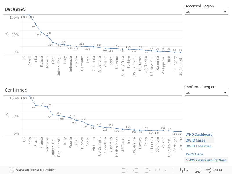
As an example, in the above dashboard, the United States (US) is selected as the target region for both deceased and confirmed case curves. Based on deceased time-series curves, DTW reports the five most similar regions immediately following the US (at 100%, since it's exactly similar to itself). Each region also includes, on the graph, the percentage similarity to the US. If you scroll to the end of the graph, you can see regions that are least similar to the US confirmed case curve. You can select any region for the target region to investigate similarities and differences in time-series sequences across all regions reporting data.
An important consideration at this point in the pandemic is: "How is the acceleration or the rate of increase in cases changing?" If it is slowing, then a region has "bent" its curve. If it is increasing, then a region has not. The trend graph shows a week-by-week representation of how a region's cases are trending from one week to the next. A flat curve indicates steady acceleration: neither an increase nor a decrease. A slight upward or downward movement represents a slight increase or decrease in acceleration, respectively. A large upward or downward movement indicates a significant increase or decrease in acceleration.
The graph is colour-coded to reinforce trend movement: grey for steady, light blue and dark blue for slight and significant decreases, and orange and red for slight and significant increases. The width of the graph's lines shows the absolute number of cases, week-by-week, for the given region.
It is important to understand that trend is the acceleration of a region's case count. For example, the trend could be downward, but the number of cases could still be increasing. What this means is that the rate of case increase has slowed. This is analogous to driving a car, where you accelerate quickly from a stoplight, then ease off the accelerator. Your acceleration (the trend in speed or rate of change in speed) is decreasing, but your actual speed may still be increasing. It is just increasing more slowly than when you accelerated away from the stoplight.
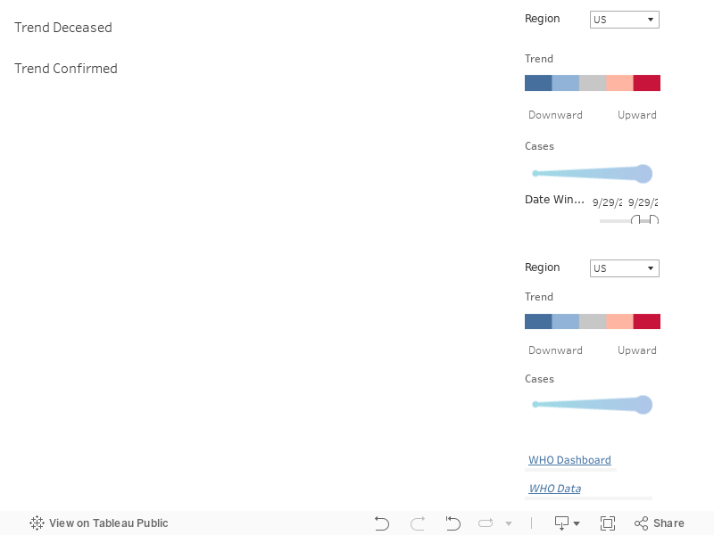
As an example, in the above dashboard, the trend graphs are shown for the United States, with deceased cases on the top and confirmed cases on the bottom. The deceased trend graph shows steady acceleration for the first four weeks as the coronavirus took hold, then significant increases in the rate of fatalities for seven weeks. Confirmed cases, on the other hand, shows a different pattern. It rose slightly, then dropped significantly and again slightly over the next two weeks. It then rose slightly and rose significantly for six consecutive weeks.
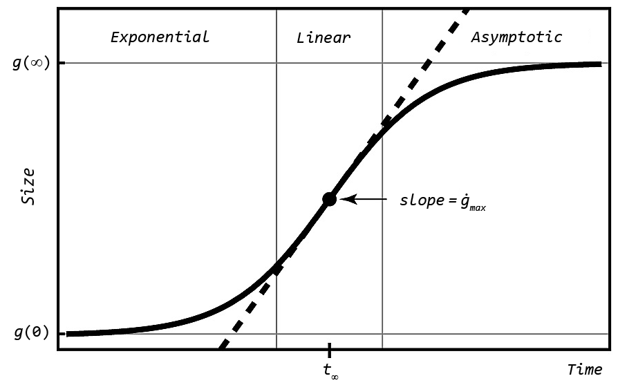
An important question is: "When will the curve 'bend,' representing the point where the rate of increase begins to reduce?" Importantly, the inflection point is not the peak of the curve. Instead, it is where the rate of acceleration in cases begins to decrease. Visually, it is the point where the slope of the time-series curve begins to flatten. We applied four parameter logistic regression (4PL) to fit a curve to a time-series sequence.
4PL computes four parameters, usually denoted \(A\), \(B\), \(C\), and \(D\), to fit a sigmoid-shaped curve to a set of points. Each of these parameters has a specific meaning for the generated curve.
Given these definitions, it is possible to compute both \(x\) from \(y\) and \(y\) from \(x\) using \(A\), \(B\), \(C\), and \(D\).
In the figure, Size is represented on the \(y\)-axis, but we can assign any property we want. We run 4PL twice with maximum cases on the \(y\)-axis, to estimate how many cases will occur when the curve bends, and to estimate how rapidly the case count is increasing when the curve bends.
An interesting property of 4PL is that it is highly sensitive to where you start on a curve. Coronavirus curves usually begin with a long, flat, low-value sequence, followed by a rapid upswing towards the peak of the curve. If we provide this type of curve to 4PL, it will assume the back end of the curve will mirror the front end (long and flat), which is almost always untrue. To combat this, we ran 4PL on multiple subsequences of a curve, then aggregated the results into a set of one or more estimates for the inflection date (\(C\)), maximum cases (\(D\)), and steepness parameters (\(B\)).
One issue with 4PL is that it assumes a single rise–fall pattern in acceleration. Since COVID has now passed through multiple waves, 4PL struggles to properly identify the functional form of the current outbreak curve. To address this, we work backwards to locate the most recent wave as follows.
This correctly identifies the most recent curve subset containing at most a single inflection point, thereby satisfying the 4PL assumptions.
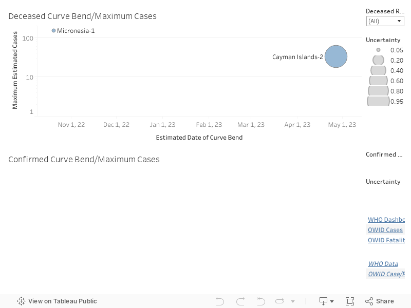
This approach has the desirable property of capturing different types of estimates generated by 4PL, then visualizing those as alternative suggestions. If more than one cluster exists for a given region, we append "-i" to the cluster's name to highlight that it is one of several possible estimates identified using 4PL.
As an example, in the above dashboard, inflection date and maximum cases are visualized for both deceased and confirmed cases. For countries with multiple estimates, multiple circles are displayed at the different estimated curve bend dates. The size of the circles visualize the uncertainty in the estimate: the large the circle, the larger the uncertainty based on the 4PL algorithm.
Another interesting question is: "How has case progression changed over the last four weeks?" This examines how a region is fairing, both in terms of its longer-term case trend and its overall case count relative to other regions. We use a scatterplot, divided into four areas, to visualize this information. Each area can be described as follows.
As an example, in the above dashboard, countries on the far left of either scatterplot have the lowest rates of increases in cases. Countries lower on the \(y\)-axis are suffering a smaller case count. Countries to the far right, on the other hand, have significantly higher rates of increase ins cases, with countries higher on the \(y\)-axis also having a high rate of cases.
Regions in the lower-left scatterplot area are managing both their case counts and their rate of case increases successfully. Regions in the upper-right scatterplot area suffered high case counts, but they are now in different stages of decreasing their rate of case increases, the first steps in recovering from the coronavirus. On the opposite side of the scatterplot, regions in the lower-right have kept case counts low, but are now seeing an acceleration in their week-over-week case counts. This places them in danger of a significant increase in future cases. Finally, regions in the upper-right area of the scatterplot have both high case counts and an accelerating case rate over the last four weeks. Further efforts are needed to stem the tide of cases and "bend" their curves to move them into the recovering region of the scatterplot.
As the pandemic progresses, the need for testing has been stressed by epidemiologists throughout the world. Testing allows officials to gain an accurate picture of how many individuals are infected with COVID-19. As the number of cases beings to decrease, it also allows new cases to be quickly identified and contact traced, to prevent re-occurrence of spikes in case counts.
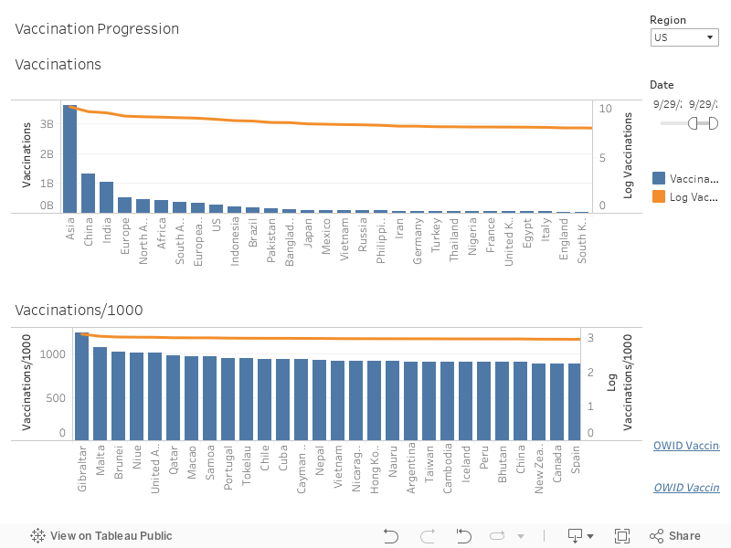
Different countries have initiated testing at different rates. Two numbers are important: the absolute number of tests run, and the number of tests per 1000 citizens, to correct for the differing populations across countries.
As an example, the above time series graph shows both the total number of tests on the top graph and the number of tests per 1000 citizens on the bottom graph for the United States. The line graph shows total tests to date. The bar graph shows total tests run for each given day. Both total tests and test per 1000 citizens are increasing, highlighting the increased importance being placed on accurate and timely testing as the outbreak continues.
Another interesting insight is how different countries compare to one another, in terms of test performed and tests per 1000 citizens performed. The bar graph below shows this comparison, with total tests on the top graph and tests per 1000 citizens on the bottom graph.
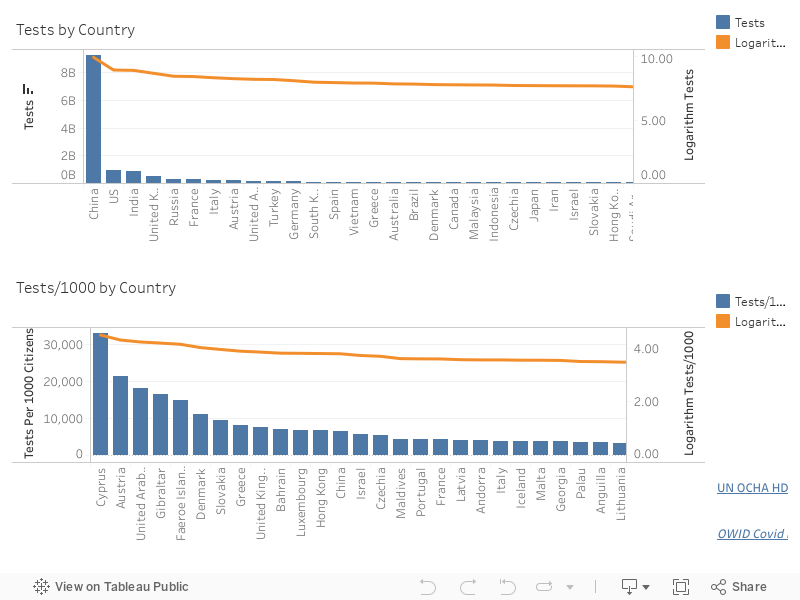
Each bar corresponds to a region, with the height of the bar representing the current total number of tests and tests per 1000 citizens. Because certain regions have large test totals, smaller region values are often difficult to compare since their bars are very short. To help with this, an orange line plotting the logarithm of total tests and tests per 1000 citizens is overlaid on the bar graph.The logarithm is less sensitive to changes in absolute totals, allowing users to compare differences in regions with smaller totals more easily.
A final test property we are tracking is the percentage of positive tests returned for all tests performed on a given day. One argument is that the number of confirmed COVID-19 cases is increasing because the total number of tests per day is also increasing. The percentage of tests that are positive is considered a more accurate method to track increases or decreases in the virus, since it ignores (or normalizes) the issue of how many tests were run. Currently, we have access to known daily positive test results for US states only. Positive rates for other countries are estimated based on the number of tests run and the number of new cases reported each day. We continue to search for additional datasets that will help us improve and expand our coverage.
Rather than cases or cases per 1000 citizens, experts often suggest using hospitalizations as a more accurate measure of COVID spread in a community. The intuition is that, unlike testing which can miss cases depending on how widespread it is, hospitalizations provide a more accurate way to compare the relative number of individuals who are infected over time.
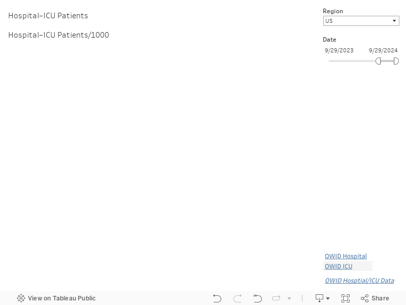
As an example, the above time series graphs show both the total number of hospitalizations and the total number of patients reported in the intensive care units (ICUs) for the United States and countries in Europe. The line graphs on the top show total hospitalizations and ICU patients. The line graphs on the bottom show hospitalizations and ICU patients per 100 citizens based on each region's population.
COVID-19 vaccinations have recently begun to be administered in various countries. For example, both the Pfizer–BioNTech and Moderna vaccines have received emergency use authorization (EUA) in the United States. The United Kingdom is now administering the Oxford–AstraZeneca vaccine. Other countries, including China and Russia, have authorized distribution of the Sputnik V and SinoPharm-CNBG vaccines developed in their own countries for use in China, Russia, the UAE, and Bahrain. Various candidate vaccines are in Phase 3 trials, including vaccines from Johnson & Johnson and Novavax.
The United States Centers for Disease Control (CDC) has initially prioritized front-line health care workers and nursing home residents for the initial vaccine doses. Distribution of the vaccine began in the middle of December, 2020, with a hope of vaccinating the US population by the end of the summer of 2021. Other countries like Canada, the United Kingdom, and Israel have also started vaccinating their citizens.
Our dashboard provides total vaccines distributed, vaccines distributed per 1000 citizens, and vaccines distributed per day for every region reporting data to Our World in Data. Currently, only a few countries are reporting data, but we expect this number to grow as the vaccine candidates are distributed throughout the world.
In addition to a time-series graph of vaccinations for a specific country, and current vaccination rates for countries throughout the world, we also provide two separate maps. The first shows full vaccination rates and vaccination concern rates for counties in the United States.
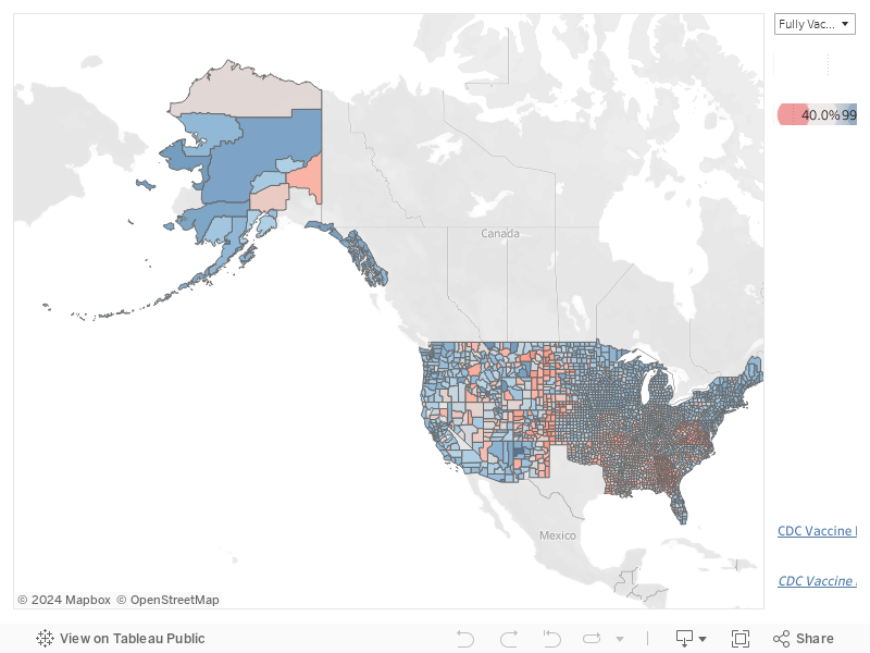
For both fully vaccinated and vaccination concern, red counties fall below the US median, and blue counties fall above the US median. For fully vaccinated rates, Texas is not reporting data, and therefore no Texas counties appear on the map for fully vaccinated rates.
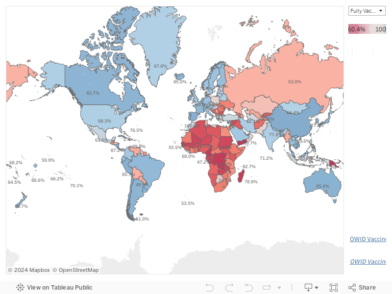
The second map shows fully vaccinated and partially vaccinated rates for countries throughout the world that are reporting data to Our World In Data. As with the US county map, red countries fall below the fully or partially vaccinated median, and blue countries fall above.
As a basic data point, total deceased and confirmed cases for each country or region are presented in the Region Totals tab.
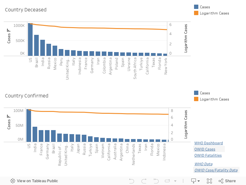
Each bar corresponds to a region, with the height of the bar representing the current total number of deceased or confirmed cases. Because certain regions have large case totals, smaller region values are often difficult to compare since their bars are very short. To help with this, an orange line plotting the logarithm of total cases is overlaid on the bar graph. The logarithm is less sensitive to changes in absolute case totals. This allows users to compare differences in regions with smaller totals more easily.
It is useful to examine how the Coronavirus has progressed to the current date. This allows us to see how the increase in the daily case rate changes, and to simply quantify how many deceased and confirmed cases exist for a given region.
Our dashboard provides deceased and confirmed case graphs for
every region reporting data to data.world. Most
time-series sequences begin on January 22, 2020. New regions are added
as time passes, however (e.g., the Northern Mariana Islands did
not being reporting data until March 23, 2020).
Finally, we provide a map of the most recent deceased and confirmed case counts for every region reporting data. These are visualized using the common dot-map approach, where the position of a dot corresponds to a region, and the colour of a dot corresponds to the value (deceased or confirmed case count) for that region.
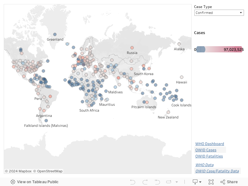
In our maps, hue represents position relative to the median, and saturation represents the distance from the median. Regions below the deceased or confirmed case count median are coloured blue, and regions above the median are colour red. The farther a region's case count deviates from the median, the more saturated its dot colour. Regions with the largest case counts are fully saturated red. Regions with the smallest case counts are fully saturated blue.
One question many people ask is: "Why is the COVID-19 epidemic so much more serious than the previous SARS or MERS epidemics?" The answer is complicated, and researchers are still investigating the details of this question. Currently, it seems to relate to the infectiousness of the disease, technically measured using \(\text{R}_0\) (R-naught, the basic reproduction number).
\(\text{R}_0\) is the number of cases expected to occur, on average, as the result of a single individual. For example, if \(\text{R}_0\) is 2, on average one infected person will pass it on to two other individuals. The goal is to drive \(\text{R}_0\) below 1, which will initiate a decrease in the total number of cases over time. \(\text{R}_0\) is also directly related to so-called "herd immunity", the idea that a controlled distribution of an infection in a population will eventually lead to population immunity as more and more individuals are infected. Unfortunately, this usually leads to a higher rate of fatality compared to more controlled approaches. Regardless, \(\text{R}_0\) predicts the amount of population immunization needed to achieve heard immunity. Once \(\frac{1}{1-R_0}\) individuals are immunized, sustained spread of the disease should decrease. In the previous example, if \(\text{R}_0=2\), then 50% of the population must be immunized to see a reduction in the spread of the disease.
The table below shows the best estimates for \(\text{R}_0\) and the fatality rate based on confirmed cases and fatalities for SARS (also known as COVID-CoV), MERS (MERS-CoV) and COVID-19 (SARS-CoV-2).
| Outbreak | \(\text{R}_0\) | Cases | Fatalities | Fatality Rate |
|---|---|---|---|---|
| SARS-CoV | 2–3.3 | 8,098 | 774 | 9.6% |
| MERS | 0.9 | 2,494 | 858 | 34.4% |
| COVID-19\(^1\) | 0.4–4.6 | 106,228,180 | 2,318,700 | 2.2% |
| \(^1\)As of February 8, 2021 | ||||
The table suggests that the \(\text{R}_0\) for SARS is higher than for COVID-19. If this is true, why did SARS die out with few infections, but COVID-19 continues to move quickly throughout the world population? Various agencies, including the CDC, suggest there are multiple reasons.
One positive property of COVID-19 is its initial fatality rate, which is estimated to be 2.3%, but possibly as low as 0.3%. SARS had an estimated rate of 9.6%. MERS was higher still, at 34.4%, or approximately 1 in 3 cases. The COVID-19 Fatality Rate has stabilized just below the expected 2.3%. However, one assumption is Cases is under-reported. If this number is properly updated, the Fatality Rate could decrease below 2.3%. An emerging issue are new variants of SARS-CoV-2 initially identified in the United Kingdom, South Africa, and Brazil. Preliminary research suggests these new variants are significantly more transmissible. If this is true, R0 could increase. Evidence is still unclear on whether this will also affect the estimated fatality rate.